1. Introduction
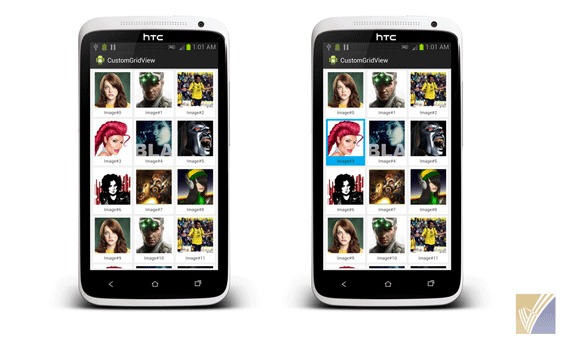
GridView is a ViewGroup that displays items in a two-dimensional, scrollable grid. In this tutorial, we’ll build an Image Gallery using a GridView in android. Each grid to display an image thumbnails and a text. While an item is selected, a toast message will display the position of the grid selected.

2. Define GridView Layout
To begin with, let us add an GridView in our main layout. If you look at the code sample below, I have added GridView with id gridView, and applied the layout attributes. Most of the android attributes are self explanatory.
MainActivity.java
<RelativeLayout xmlns:android="http://schemas.android.com/apk/res/android"
    xmlns:tools="http://schemas.android.com/tools"
    android:layout_width="match_parent"
    android:layout_height="match_parent"
    android:background="#f0f0f0"
    tools:context=".MainActivity" >

    <GridView
        android:id="@+id/gridView"
        android:layout_width="fill_parent"
        android:layout_height="wrap_content"
        android:layout_margin="5dp"
        android:columnWidth="100dp"
        android:gravity="center"
        android:numColumns="auto_fit"
        android:verticalSpacing="5dp"
        android:drawSelectorOnTop="true"
        android:stretchMode="columnWidth" >
    </GridView>

</RelativeLayout>
3. Define Grid Item Layout
If you look at the image below, my GridView is consists of an ImageView and an TextView. Here let us define the layout for one row. This layout will be intern used by the GridView adapter. Create row_grid.xml inside your project layout folder.
row_grid.xml
<LinearLayout xmlns:android="http://schemas.android.com/apk/res/android"
    xmlns:tools="http://schemas.android.com/tools"
    android:layout_width="wrap_content"
    android:layout_height="wrap_content"
    android:layout_marginTop="5dp"
    android:orientation="vertical"
    android:padding="5dp"
    android:clickable="true"
    android:background="@drawable/grid_color_selector"
    android:focusable="true">

    <ImageView
        android:id="@+id/image"
        android:layout_width="100dp"
        android:layout_height="100dp" >
    </ImageView>

    <TextView
        android:id="@+id/text"
        android:layout_width="fill_parent"
        android:layout_height="wrap_content"
        android:layout_marginTop="5dp"
        android:gravity="center"
        android:textSize="12sp" >
    </TextView>

</LinearLayout>
4. Custom GridView Adapter
- Create a new class called GridViewAdapter that extends
ArrayAdapter. This class will be used by GridView in order to render its contents. - The getView() method implementation is necessary is. This method creates a new View for each image added to the
GridViewAdapter. - When this is called, a View is passed in, which is normally a recycled object, so there’s a check to see if the object is null. If it is null, an
ViewHolderis instantiated and configured for holding an ImageView and a TextView. - ViewHolder design patterns are efficient while using composite layouts.
GridViewAdapter.java
public class GridViewAdapter extends ArrayAdapter {
	private Context context;
	private int layoutResourceId;
	private ArrayList data = new ArrayList();

	public GridViewAdapter(Context context, int layoutResourceId,
			ArrayList data) {
		super(context, layoutResourceId, data);
		this.layoutResourceId = layoutResourceId;
		this.context = context;
		this.data = data;
	}

	@Override
	public View getView(int position, View convertView, ViewGroup parent) {
		View row = convertView;
		ViewHolder holder = null;

		if (row == null) {
			LayoutInflater inflater = ((Activity) context).getLayoutInflater();
			row = inflater.inflate(layoutResourceId, parent, false);
			holder = new ViewHolder();
			holder.imageTitle = (TextView) row.findViewById(R.id.text);
			holder.image = (ImageView) row.findViewById(R.id.image);
			row.setTag(holder);
		} else {
			holder = (ViewHolder) row.getTag();
		}

		ImageItem item = data.get(position);
		holder.imageTitle.setText(item.getTitle());
		holder.image.setImageBitmap(item.getImage());
		return row;
	}

	static class ViewHolder {
		TextView imageTitle;
		ImageView image;
	}
}
The above adapter is working on a Pojo Class.
ImageItem.java
public class ImageItem {
	private Bitmap image;
	private String title;

	public ImageItem(Bitmap image, String title) {
		super();
		this.image = image;
		this.title = title;
	}

	public Bitmap getImage() {
		return image;
	}

	public void setImage(Bitmap image) {
		this.image = image;
	}

	public String getTitle() {
		return title;
	}

	public void setTitle(String title) {
		this.title = title;
	}
}
5. Using GridView Adapter in Activity
Instantiate the GridView by using findViewById(int) method. This method takes the same id as provided in the layout xml file. The setAdapter() method then sets a custom adapter (GridViewAdapter) as the source for all items to be displayed in the grid.
MainActivity.java
public class MainActivity extends Activity {
	private GridView gridView;
	private GridViewAdapter customGridAdapter;

	@Override
	protected void onCreate(Bundle savedInstanceState) {
		super.onCreate(savedInstanceState);
		setContentView(R.layout.activity_main);

		gridView = (GridView) findViewById(R.id.gridView);
		customGridAdapter = new GridViewAdapter(this, R.layout.row_grid, getData());
		gridView.setAdapter(customGridAdapter);
	}

	private ArrayList getData() {
		final ArrayList imageItems = new ArrayList();
		// retrieve String drawable array
		TypedArray imgs = getResources().obtainTypedArray(R.array.image_ids);
		for (int i = 0; i < imgs.length(); i++) {
			Bitmap bitmap = BitmapFactory.decodeResource(this.getResources(),
					imgs.getResourceId(i, -1));
			imageItems.add(new ImageItem(bitmap, "Image#" + i));
		}

		return imageItems;

	}

}
6. Handling GridView Click Event
To do something when an item in the grid is clicked, the setOnItemClickListener() method is passed a new AdapterView.OnItemClickListener. This anonymous instance defines the onItemClick() callback method to show a Toast that displays the index position (zero-based) of the selected item. In a real world scenario, the position could be used to get the full sized image for some other task.
gridView.setOnItemClickListener(new OnItemClickListener() {
		public void onItemClick(AdapterView<?> parent, View v,
			int position, long id) {
			Toast.makeText(MainActivity.this, position + "#Selected",
					Toast.LENGTH_SHORT).show();
		}

});
7. Customizing GridView Style
Now, we are preitty much good with the GridView galelry. But what if we want to change the background color of a grid item while user is pressing?.
Let us define a color selector grid_color_selector.xml (code provided below) and place it inside drawable folder. We can use a selector with grid_row.xml layout file by using android:background attribute.
<?xml version="1.0" encoding="utf-8"?>
<selector xmlns:android="http://schemas.android.com/apk/res/android">
    <item android:drawable="@color/blue" android:state_pressed="true"/>
    <item android:drawable="@color/blue" android:state_selected="true"/>
    <item android:drawable="@color/white"/>
</selector>
8. Download Complete Example
Here you can download complete eclipse project source code from GitHub.


